📘 Project Information
The project domain we are working on is
Nutrition and Lifestyle data as it relates to
the topic Data Visualization of public Health
or Environment Data, which is given to us.
This domain contains analyzing and
visualizing various health-related factors
such as obesity rates, malnutrition levels,
and dietary habits, which are critical factors
affecting individual and community well-
being.
By using Python, R, and Power BI, our
project will turn raw datasets into clear and
interactive visualizations. These visual
insights will help spot patterns, trends, and
connections in nutrition and lifestyle data
from different regions and populations.
The main goal of our project is to show how
data visualization can make complex health
information easier to understand. It can
help with policymaking, raise awareness,
and promote healthier lifestyle choices to
improve public health outcomes.
📖 Introduction
With the rise of health and environmental issues, visualization plays a luxurious role in presenting large datasets in a way that feels timeless and professional.
▶️ Video credit: This video is taken from the YouTube Channel Centers for Disease Control and Prevention (CDC).
⚠️ Problem Statement
1. Obesity Trends Analysis
Even with increasing awareness about health, obesity rates are rising steadily among different populations, particularly in children and teenagers. There is not enough clear data visualization that shows how obesity is spread across age, gender, and region. This gap makes it difficult for policymakers and health professionals to create focused interventions.
2. Malnutrition Monitoring
Malnutrition, which includes both undernutrition and overnutrition, remains a significant global challenge, particularly in developing countries. However, the data we have on malnutrition is often broken up and not effectively visualized. This makes it difficult to track progress towards health-related goals like the UN Sustainable Development Goals (SDGs).
3. Dietary Habits and Lifestyle Impact
Unhealthy eating habits, including the high intake of fast food and sugary drinks, are closely linked to lifestyle diseases. Yet many communities lack detailed data-driven insights into how these habits relate to obesity, diabetes, and heart disease risks. Without effective visualization, it is hard for individuals and public health authorities to understand and respond to these patterns.
🔎 Observation and Analysis
Here is the Data of First 50 Entries:
If you want to check all the data you can visit this link : View on Google Sheets
📚 Literature Review
-
C. Malhotra, V. Kotwal and A. Basu, "Designing National Health Stack for Public Health: Role of ICT-Based Knowledge Management System,"
in 2019 ITU Kaleidoscope: ICT for Health: Networks, Standards and Innovation (ITU K),
Atlanta, GA, USA, 2019, pp. 1–8.
Keywords: Diseases, Public healthcare, Knowledge management, ICT, Biological system modeling, API, Digital service standards, Emerging technologies (IoT, Blockchain, Wearable/Immersive technologies), KMS, NHS, Public health, QoL. -
J. L. Nitzkin and C. Buttery, "Public Health Information Infrastructure,"
in IEEE Engineering in Medicine and Biology Magazine,
vol. 27, no. 6, pp. 16–20, Nov.–Dec. 2008.
Keywords: Public healthcare, Diseases, Biomedical informatics, US Government, Management training, Protection, Laboratories, US local government, Resource management, Collaboration. -
J. Menghan and Z. Cheng, "Research on Public Risk Perception of the Public Health Emergency in Remission Period,"
in 2020 International Conference on Public Health and Data Science (ICPHDS),
Guangzhou, China, 2020, pp. 202–205.
Keywords: Temperature measurement, Epidemics, Attitude control, Lung, Ventilation, Indexes, Public healthcare, Public health emergencies, Remission period, COVID-19, Risk perception, KAB model.
🔖 Credits: All research articles cited above are sourced from IEEE Xplore and respective conference/journal publications. Proper credit to original authors and publishers has been maintained.
🛠️ Methodology
The methodology of this Project can be understand by following ER Diagram.
🩺 Conclusion
- Enhanced Understanding: Data visualization simplifies complex public health data, making patterns and correlations easier to interpret. It helps stakeholders quickly grasp critical health trends and take informed actions.
- Effective Decision-Making: By presenting data visually, policymakers and health professionals can identify areas needing urgent attention, improving the accuracy and speed of decision-making processes.
- Improved Public Awareness: Visual representations of health statistics increase public engagement and awareness, encouraging communities to adopt preventive health behaviors and stay informed.
- Efficient Resource Allocation: Visual analytics assist authorities in pinpointing high-risk zones and optimizing resource distribution such as vaccines, medical staff, and equipment.
- Future Prospects: With advances in digital technologies, integrating AI-driven and real-time visual dashboards will further strengthen data-based public health monitoring and policy development.
📈 Visualisations
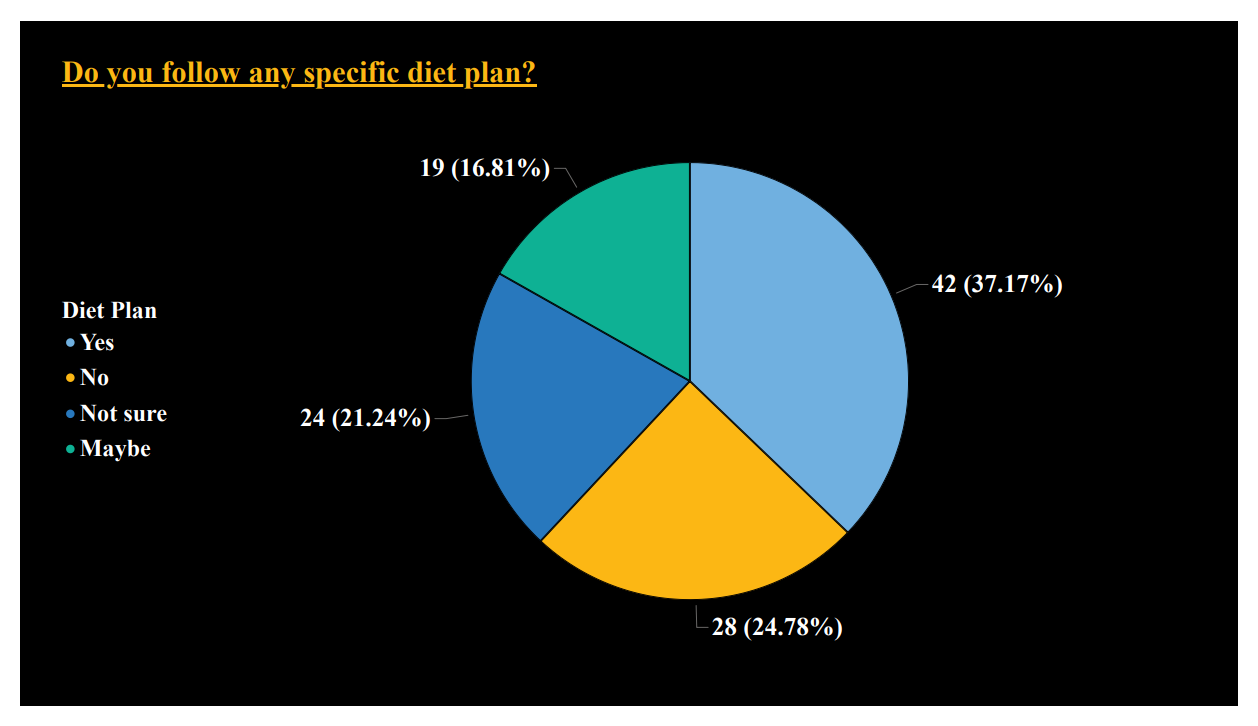
🥧 This Pie Chart shows Does people have any specific Diet-Plan or Not !!!
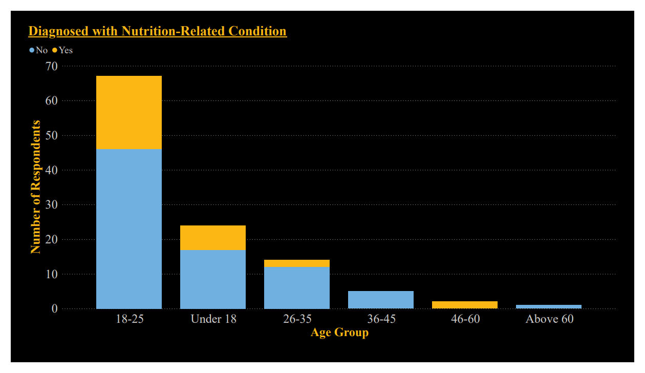
📊 This Bar Chart shows Does people are Diagnosed with Nutrition-Realated condition or Not !!!